Most people may easily grasp why color and layouts are so important in developing a productive website design. However, few may realize that an equal amount of importance should be afforded to choosing the right typography. While the layout and color scheme you choose for your site will affect the reader indirectly, the typography is a direct means of communicating with your reader. Without it your readers will only have a vague idea of what you want them to do. Consider the words of design experts from Website Design Basics,
“Good typography is part of web page design and is necessary to communicate with your users. Your typography should be pleasing to look at and easy to read.”
 This requires several factors that must be taken into consideration. Understanding first that your reader will most likely be able to change the size of the font that appears on their screen, or even how it appears, and you may feel that this decision is out of your control. However, in designing your website you simply need to make sure that the typeface you choose will be easily read within a wide variety of fonts and size options.
The Typeface
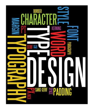
The first rule to choosing the typeface will be to select a font that evokes the feel of your site. There are two different groups that you should evaluate; serif and sans-serif.
Serifs are fonts that add extra lines to the main strokes of the typeface. While these are very easy to read on the printed page they can often present a problem when looking at them on a computer screen. Sans-serif fonts do not have the added strokes so they will appear to be much cleaner than the serif so choose accordingly.
Contrast
This focuses on the difference between the print and the background. The most common form of contrast is black text on a white background. This makes the content much easier and more comfortable to read. Try to avoid choosing colors that are close together. Yellow print on a white background will be impossible to distinguish and will most likely discourage your reader.
Line Length
Also consider how long each line of text will be. You don’t want your reader to have to continuously scroll back and forth across the screen to get through your text. Instead create narrower columns to make the reading easier.
Alignment
While you may feel that right text alignment can give your site a bit of uniqueness, remember that you want the experience of your reader to be easy. Right and justified alignments tend to be more difficult to read through, and readers can easily get lost when they’re going through the site. The most comfortable reading for most readers is left alignment or “ragged right.”
There is much more involved with website typography than choosing the right font, but remember that simplicity is often the better choice. Consider the advice given by Paul Scrivens of Smashing Magazine,
“Try going through all of the Web designs that you love, strip out the images and ask yourself ” how would that website look with just text and spacing?” When designers say, “text is the interface”, they really do mean it.”
Learning how to choose a typeface that will inspire your readers and still carry the message that you expect to deliver through your web pages is a fundamental part of web design that you may not have considered before. Once you realize that choosing a font for the printed page is very different from choosing a web design font, you’ll begin to understand how important the typeface will be for your new site.