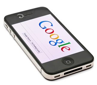
Over 90% of all people on Earth have a mobile phone, and half of those are smart phones. And when you consider the fact that around half of smart phone owners use their mobile as their main form of internet access you might begin to see that having a website that mobile users can use just as well as if they were on a desktop computer is important.
 From a web design point of view there are two approaches you can use when incorporating mobiles into the equation which is a mobile friendly design, or have a mobile optimized website. To find out what these are, and which one you should go with in order to provide a better end user experience read on.
Mobile Friendly Websites
Smart phones are very clever when it comes to transforming a website that has been coded for the desktop computer into a version that can be used on them. However, the transformation is not perfect and the end result isn’t a complete solution. There are some features that work well on mobile friendly websites such as a decrease in file sizes, and this is important because smaller image sizes leads to quicker load times. On average mobile internet connections are not as quick as those of desktop computers which is why smaller file sizes are ideal.
There are a lot of mobile phones and such as the Apple’s iPhone that doesn’t support Adobe Flash. Since a lot of pages on the internet require the use of Flash smart phones had to find solutions for the problem, which include implementing slideshows and image rotators.
The Pitfalls Of Mobile Friendly Websites
The problem with mobile friendly websites is that not all of the mobile devices out there can handle a lot of the fancier websites. This means many businesses are losing a lot of customers because they simply go elsewhere when they run into a frustrating mobile browsing experience. One of the drawbacks is that the font is too small to read, which means the user has to zoom in and out in order to navigate the website and that can get annoying very quickly. The mobile optimized websites, on the other hand, will have a larger font size where the constant zooming in and out is not required.
Another drawback is that some links can be difficult to click, and if links are grouped together then you could potentially click the wrong one which only increases the time it takes to get what you want out of a website.
Mobile Optimized Website
The mobile optimized websites are different from the mobile friendly ones because they have code written specifically for mobiles devices. This means that the website is essentially designed separately and that is an advantage since the designer can create the elements that are ideal for mobiles without having to think about desktop computers.
Generally, mobile websites are optimized by having less clutter, bigger buttons, fewer images, larger font sizes and a navigation style that is very intuitive. The big buttons are important because it allows for easy access with the thumb which is what most people use to make contact with their mobile phone screens.
Another feature is that typing is required as little as possible and this addresses the fact that typing on a mobile phone takes more effort and time than doing so on a keyboard. Even if you have a big tablet such as the iPad typing can become a nuisance because you have to keep changing the way you hold the device as you are navigating through the website.
However, just like with the maintenance of normal websites, the mobile versions also need to be well maintained. So if any new features are made available you need to incorporate them into your design so that you are not left behind your competitors. This essentially means you have to maintain two websites: the ones for desktop computers and the ones for mobiles.
Click To Call
One cool ergonomic feature that mobile optimized websites have is the ability to click on phone numbers that appear on websites and access the call function. This is more straightforward than writing down the number on a piece of paper and dialing it manually.
Functions such as this one is about allowing the user to do more in a given amount of time and in a manner that has less hassle. Providing an experience for the end user that is well designed will improve engagement and that in turn could lead to more sales, or at least more social shares.