 There are many categories of web design that focus around the responsiveness of a website, and most of them catalog ideas about how users view the content that you’re posting. While this is certainly the main factor in an aesthetically appealing site, it is also detrimental to a smoothly transitioning website, as each and every feature included in your design has an impact on the overall experience of your users.
For a look at some common techniques and practices that can greatly improve your traffic, and increase the positive response from users, check out these tips for a user-friendly experience.
Responding To Any Appliance
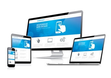
Being responsive means having the ability to respond in any environment or device, including tablets, laptops, PCs, MACs and of course mobile phones. In this day and age the majority of the population doesn’t want to switch between devices in order to view certain sites, access certain applications, or utilize a particular web tool. The world is craving convenience, fluidity, and above all, the ability to save time; this is why the first step toward designing a successful site, is being certain that it will respond on any platform.
Size Matters
This may not be true in all areas of web design, but when it comes to your content, it must be available and look its best at any size. Think about it this way: if you don’t give consumers what they want in a website, they will find one elsewhere that allows them to view it from the device in use. For this reason and many others, you must evolve with the web and build content that can be loaded in a variety of sizes without losing color, clarity, or space.
Nothing is worse than loading a blog only to find out that the photos are so big, they can only be viewed from a computer. It means that those users checking your blog from their mobile phone will see half an image, or sometimes no image at all, making the overall experience of the website subpar. You can change your CSS rules for style on a device by device basis, making it much easier to obtain the same experience, no matter what size your screen is.
Browser Compatibility And Social Media Platforms
Other than size and device usage, there is also browser compatibility to take into consideration when designing a website for optimal viewing capacity. Not everybody is using Safari or Chrome to view the content on your site, which means that Explorer, Mozilla, and other web tools must also be considered in the overall design and placement of content.
Something that many web designers are now doing is updating their designs to include Facebook and Twitter viewing capabilities. Viewing images, articles, and sharing content through social media has changed the way that many individuals and businesses use the internet, but it has also changed the overall design of many websites, making it pertinent that all new CSS frameworks include such progressive enhancement.
Test Your New Look
Tried and true is the only way to launch a new design, and this means taking on the task of viewing your website from all ranges of device, size, and location. As responsive website design has become increasingly popular over the last 5 years, there are various tools and applications that you can use to run these tests. Programs that use mobile emulators and site validators are a good way to factor in the mobility of your design, while some browsers offer resizing tools for responsive design built into their consoles. Chrome and Mozilla Firefox are two such browsers that take this task into consideration and make it much easier for web designers to complete all of their necessary research before making any permanent changes.
Taking the users point of view into consideration is much easier after having walked a mile in their shoes, so don’t make the assumption that your design is versatile enough without having done the legwork to back this thought process up. Unifying content is often much easier than segregating it, which is why these tools work so well to help create a uniform look on all of the platforms your users might utilize throughout their daily browsing.
Watch Out For Advertisements
While advertisements have become a necessary part of modern web design, many designers are still struggling to include banners and videos in their range of fluid optimization. Unfortunately, creating a responsive website should make videos and ads visible to all users, and this might be something that 2015 will bring to fruition. In the meantime, finding ways to work around this problem can be helpful in increasing traffic and consumer satisfaction.